Color Psychology in Home Interior Design
Color Psychology in Home Interior Design plays a central role in shaping how people experience and interact with their living spaces. The colors chosen for walls, furniture, textiles, and décor influence mood, behavior, and comfort level. Thoughtful color selection goes beyond visual appeal. It connects psychological responses, spatial perception, and functional needs of each room. Understanding how specific colors affect energy, calmness, motivation, or relaxation allows homeowners to create spaces that support the lifestyle they want to live.
In modern interior planning, color is not an afterthought. It is a structural design element that affects lighting, depth, room scale, and emotional experience. A home that successfully applies color psychology feels intentional, balanced, and deeply aligned with the people who inhabit it.
The Psychological Foundation of Color Selection
Color interacts with the human brain through visual signals that trigger emotional and physiological reactions. These reactions can vary based on personal memories, cultural influences, and sensitivity. However, general psychological patterns associated with color are widely observed and inform design choices.
Key considerations when applying color therapy in interiors:
- Warm and cool tones evoke different emotional states
- Saturation affects energy levels within a space
- Lightness or darkness influences perception of openness or intimacy
- Color temperature changes under natural and artificial lighting
- Repetition of a color throughout a home supports continuity and flow
The goal is not to apply as many colors as possible but to use selective, intentional palettes that enhance function and emotional well-being.
Understanding Warm vs Cool Colors
Warm and cool tones shape how we perceive comfort and atmosphere. Choosing between them requires clarity about how each room will be used.
Warm Colors
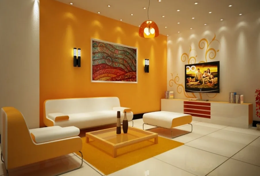
Warm tones such as red, orange, and yellow create energy and stimulation. They draw attention and make spaces feel lively and inviting. These colors are useful in social and communal rooms where interaction is encouraged.
Common effects of warm tones:
- Increase appetite and conversation in dining rooms
- Stimulate creativity in kitchens or workspaces
- Add intimacy to large open living areas
However, overly saturated warm colors can feel overwhelming if not balanced with neutrals or natural textures.
Cool Colors
Cool hues such as blue, green, and violet promote calmness and relaxation. These colors are ideal for spaces intended for rest, focus, or wellness.
Common effects of cool tones:
- Lower stress levels in bedrooms and meditation spaces
- Improve concentration in study rooms or home offices
- Create a sense of airiness in small or crowded rooms
Cool tones benefit from warm accents to prevent a space from feeling clinical.
Neutrals as Structural Anchors in Design
Neutral colors form the backbone of most interior palettes. Neutrals include whites, grays, browns, beiges, and muted toned-down versions of other colors.
Their function:
- Provide balance between strong color accents
- Allow furniture and architectural features to stand out
- Enhance natural light reflection in smaller rooms
Neutrals make a room feel timeless and adaptable. They also create a background that encourages emotional calm.
Layering Neutrals
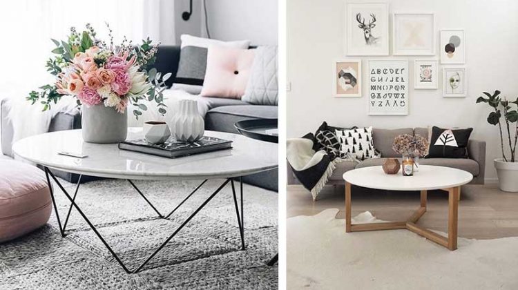
A common technique involves layering multiple tones of one neutral family. This avoids monotony while preserving simplicity. For example, a living room may include:
- Soft gray walls
- Warm gray upholstered seating
- Charcoal throw pillows
- Light wood flooring
The result is a cohesive environment that feels both structured and inviting.
Room-by-Room Color Psychology Application
Different rooms serve different functions. Color selection should match each room’s purpose and the behavior it encourages.
Living Room
The living room is typically a social and multifunctional environment. Balanced color schemes work best here. Warm tones can encourage friendliness and conversation, while neutral bases maintain elegance and versatility.
Strategies:
- Use light neutrals on walls for visual openness
- Incorporate warm tones in textiles or artwork for energy
- Add plants to introduce natural color and life
Kitchen
The kitchen is an active space involving movement, creativity, and nourishment. Bright colors can energize the environment, while softer tones promote focus and clarity.
Effective palettes:
- Warm earthy tones to inspire appetite
- Muted greens to communicate freshness and wellness
- Crisp whites paired with wood for cleanliness and comfort
Bedroom
Bedrooms benefit most from calming color palettes.
Ideal bedroom tones:
- Soft blues to support rest and lower heart rate
- Lavender for emotional calming
- Sage greens to evoke nature and grounding
Avoid intense colors that stimulate energy and disrupt sleep quality.
Bathroom
Bathrooms serve both practical and relaxation purposes. Cool colors and neutrals support feelings of freshness and clarity.
Approaches:
- Light gray or pale aqua for spa-like atmosphere
- Stone textures for natural calmness
- Avoid overly dark tones that reduce visual clarity
Home Office
Color directly affects productivity and focus.
Recommended schemes:
- Blues and greens to maintain focus and stability
- Earth tones to reduce distraction
- Pops of yellow to spark creativity without overwhelming the senses
Lighting and Its Influence on Color Perception
Light changes how colors appear throughout the day. Natural sunlight shifts from bright white to golden tones, altering hues. Artificial lighting can warm, cool, or flatten colors depending on bulb type and intensity.
Considerations:
- North-facing rooms receive cooler light, favoring warmer color palettes
- South-facing rooms receive stronger light, supporting both warm and cool palettes
- LED lighting with adjustable temperature provides flexibility
Testing color under morning, afternoon, and evening lighting ensures the final result aligns with expectations.
Color Combinations and Harmonious Palette Construction
More important than choosing a single color is knowing how colors interact. Harmony prevents overstimulation and encourages flow.
Common palette-building methods:
- Monochromatic: variations of one hue for simplicity
- Analogous: neighboring hues to create softness and unity
- Complementary: opposing hues for visual interest and balance
Effective interior design often blends one dominant color, one supporting color, and one accent.
Texture, Material, and Finish Influence
Color does not exist alone. Texture changes how color is experienced.
Examples:
- Matte finishes absorb light for softness
- Gloss finishes reflect light and create vibrancy
- Natural wood warms up cooler tones
- Metal accents sharpen visual contrast
Combining materials gives depth and personality to a room’s palette.
Incorporating Personal Identity and Memory in Color Choices
While psychology provides guidelines, emotional associations are personal. A color that feels calming to one person may feel dull to another. The best palette acknowledges both psychological effects and personal experience.
Homeowners should consider:
- Colors that evoke positive memories
- Shades linked to cultural meaning
- Tones that match lifestyle rhythms
A successful home interior expresses the identity of those who live in it.
Frequently Asked Questions
Can bold colors work in small spaces?
Yes, but use them strategically. Apply bold shades as accent walls, artwork, or textiles rather than across full surfaces. This creates visual interest without making the room feel smaller.
How do I choose colors if multiple people have different tastes?
Start with a neutral foundation to establish harmony. Then incorporate personal color preferences in smaller, changeable elements like pillows, throws, or accent chairs.
Are dark colors always overwhelming in a home?
Not necessarily. Dark colors can add sophistication, depth, and intimacy. They work well in rooms intended for relaxation or evening use, such as dining rooms or dens.
How often should interior colors be updated?
There is no strict timeline. However, adjusting accent colors every few years keeps a space feeling current without requiring full repainting or new furniture.
What colors are best for improving mood during winter?
Warm earth tones, soft yellows, and natural greens help counter winter dullness by providing warmth and grounding energy.