Modern Exterior Paint Color Combinations
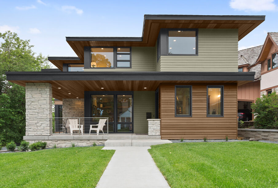
Modern Exterior Paint Color Combinations play a significant role in shaping the character, curb appeal, and long-term visual value of a home. Choosing the right palette involves more than matching attractive shades. Exterior color combinations interact with natural light, surrounding landscape, architectural form, and neighborhood context. Colors also influence how large or compact the home looks, how inviting it feels, and how well it blends into or stands out from its environment. Selecting the right mix requires understanding color theory, finishes, material pairings, and how tones behave in different lighting throughout the day.
In modern residential design, exterior color trends lean toward clean simplicity, bold contrasts, and natural-inspired palettes that create visual harmony. The goal is to achieve a look that feels timeless yet contemporary, expressive yet refined.
The Importance of Architectural Style in Color Selection
Before choosing exterior paint colors, the architectural style of the home should guide the palette. Different structures carry different visual languages, and color enhances those architectural expressions.
Contemporary Homes
Contemporary homes often feature flat planes, geometric shapes, and large window expanses. Their clean silhouettes benefit from crisp neutrals, deep monochromatic contrast, and subtle wood or stone accents. Colors should highlight these lines instead of overwhelming them.
Traditional and Craftsman Homes
These homes benefit from warmer, earthier colors. Muted greens, browns, and soft creams complement textured siding, wooden trims, and gabled rooflines. The goal is to create a welcoming, grounded feeling.
Mid-Century Homes
Mid-century modern homes thrive with warm wood tones, charcoal, and bold color accents. Their clean horizontals and low profiles do well with palettes that emphasize visual flow and natural surroundings.
Understanding Color Undertones and Their Impact
Exterior colors often have subtle undertones that influence how they look outdoors. Sunlight, shade, and reflection from surrounding surfaces can shift how colors appear.
Cool Undertones
Blues, grays, and slate-based tones provide a calm, crisp look. They work well in coastal regions, urban environments, and modern home designs. Cool colors tend to recede visually, making a home appear larger and more spacious.
Warm Undertones
Warm tones such as beige, tan, clay, and muted terracotta feel inviting and organic. They blend naturally with landscapes full of trees, grass, and earth. Homes in wooded or rural settings benefit from these tones.
Neutral Base Shades
True neutrals with balanced undertones are versatile and timeless. They provide a foundation for bold trim or accent colors while supporting long-lasting appeal.
Modern Color Combination Strategies
Creating strong exterior palettes involves intentional layering of base color, trim, and accent details. Each layer should support balance and cohesion.
Light Base with Dark Trim
A light main color paired with dark trim creates clean definition and structural clarity. This approach works well in modern and transitional designs where the geometry of the house is a visual focus.
Ideal combinations include:
- Soft warm white siding with deep charcoal trim
- Pale beige siding with black window casings
- Gray-white siding with slate or deep navy trim
Dark Base with Light Trim
Dark exteriors have become popular for their dramatic effect. The contrast with lighter trim prevents the home from feeling too heavy.
Examples:
- Charcoal siding with crisp white trim
- Deep forest green siding with cream accents
- Navy blue siding with warm gray trim and wood door accents
Monochromatic Layering
Monochromatic palettes use different shades of one color family. This creates a seamless, sophisticated visual flow, especially on contemporary facades.
Natural Exterior Material Integration
Paint colors should harmonize with building materials like:
- Natural wood siding
- Stone veneers
- Metal roofing
- Brick or concrete finishes
The key is balance. If a material has strong color presence, paint should complement rather than compete.
Popular Modern Exterior Paint Color Combinations and Why They Work
Certain color pairings consistently perform well due to their versatility, balance, and aesthetic depth.
Soft Gray with Matte Black Accents
This pairing creates a clean, modern look that suits both suburban and urban environments. Gray is neutral enough to blend into natural surroundings, while black grounding elements provide sharp sophistication.
Warm White with Natural Wood and Iron Elements
This combination brings warmth and calm. The white keeps the home feeling fresh, while natural wood introduces texture and authenticity. Matte iron hardware or railings add structure and contrast.
Earthy Olive with Bronze and Cream Trim
An earthy tone like olive connects the home to nature. Cream trim softens the contrast, and bronze or brass elements add subtle elegance.
Charcoal with Cedar Trim
Deep charcoal exteriors paired with warm cedar offer a balanced mix of boldness and organic warmth. This blend is particularly well-suited to modern cabins and contemporary suburban homes.
Considering Regional Climate and Lighting
Climate and natural surroundings influence how paint colors appear and age.
Homes in Sunny Climates
Strong sun can wash out colors or make warm tones look overly bright. Cooler neutrals and mid-tone grays maintain visual balance.
Homes in Cloudy or Northern Regions
Darker tones can make homes feel grounded and cozy in low light environments. Earth tones, deeper blues, and rich greens perform well.
Homes in Humid or Coastal Regions
High-moisture climates benefit from paint colors that mask natural wear. Soft grays, whites, and weathered tones complement coastal surroundings while resisting visual aging.
Finish and Paint Sheen Considerations
The finish affects how color translates on siding.
- Matte or eggshell reduces glare and suits large wall surfaces
- Satin is appropriate for trim and doors due to its durability
- Semi-gloss is best for high-contact elements such as railings or shutters
The sheen level impacts how architectural details are perceived, so it must be selected with precision.
Accenting Architectural Features with Color
Not all features should be painted the same. Strategic highlighting draws attention where it matters most.
Highlight-worthy features:
- Windows and trim should reinforce structure
- Entry doors benefit from warmth or boldness to create a welcoming focal point
- Porch posts, beams, or shutters can introduce layered depth
Avoid over-accenting, which may cause visual clutter.
Frequently Asked Questions
How do I test paint colors for exterior use?
Always sample colors on multiple exterior walls. Sunlight changes tones throughout the day. Paint test swatches at least 2 ft by 2 ft and observe morning, midday, and evening light before finalizing.
Should the garage door match the trim or the siding?
If the goal is subtlety, match the garage door to the siding so it blends into the façade. If the garage is a key architectural feature, match it to the trim for emphasis.
How can I make a small home exterior appear larger?
Use light to mid-tone colors with minimal contrast. A monochromatic palette can visually expand the structure. Avoid very dark colors which may visually shrink the building.
Can bold colors work on a modern exterior?
Yes, but use them intentionally. Bold colors are most effective on front doors, window frames, or small architectural elements. The main siding should remain neutral to ensure longevity.
How often should exterior paint be refreshed?
Depending on climate, paint quality, and maintenance, exteriors typically need repainting every 7 to 12 years. Homes in harsh climates may require shorter intervals.